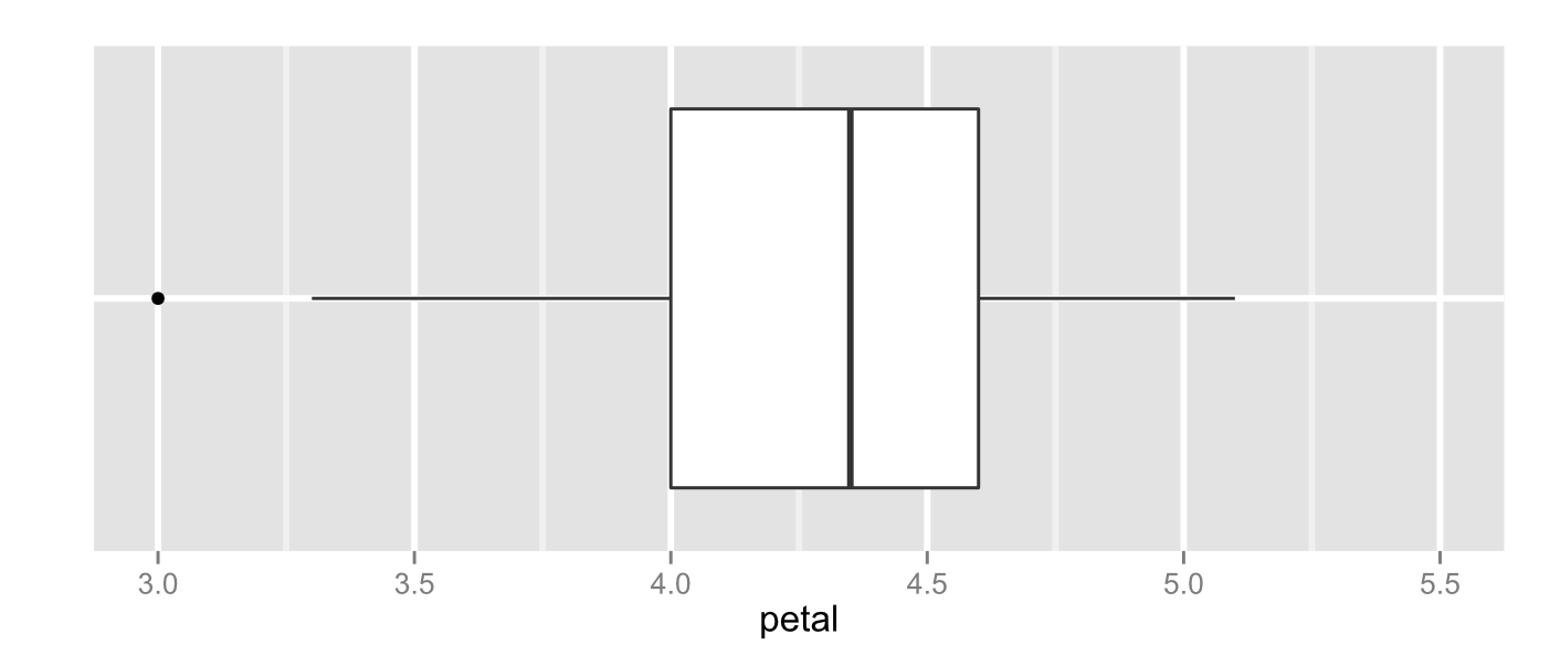
The range, as we discussed last time, isn’t really used as a measure of variability these days and the IQR isn’t terribly informative.
Since I’m a big fan of checking the density of data as a descriptor let’s try that before we continue. Let’s grab those objects we made last time.
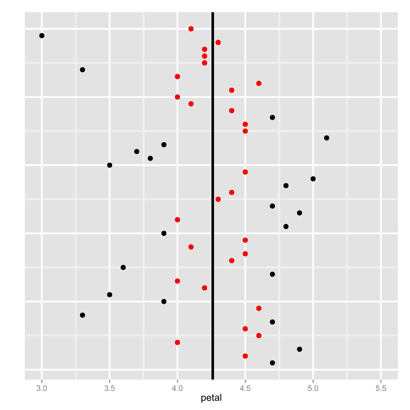
versi <- iris[iris$Species=='versicolor',]
petal <- versi$Petal.Length
y <- 1:50
versidf <- data.frame(y, petal)
Okay, let’s try it out with both ggplot2 and with the base R functions. Remember that you have to load ggplot2 with the library() function each time you start R!
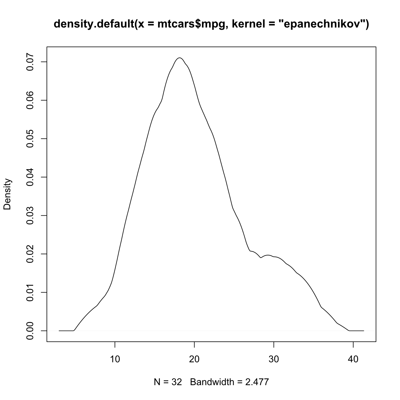
Just for fun let’s compare the typical Gaussian density with the much more exotic rectangular density. It would be comforting to see that densities are essentially in agreement even when we change something as fundamental as the kernel. After all we know that no description of the data will be perfect so knowing that the description isn’t going to randomly be misleading is nice.
plot(density(petal),col="#E69F00")
lines(density(petal, kernel = “rectangular”),col="#000000"))

p <- ggplot(versidf, aes(x = petal))
p + 	geom_density(kernel = 'rectangular', size=1, color="#000000") +
	geom_density(size=1, color="#E69F00") +
	theme(panel.grid.major = element_line(size = 1),
		panel.grid.minor = element_line(size = .8))

Yep those are both in agreement about where the mass of the data is. There are a lot of other densities we could use like the Epanechnikov, triangular, biweight, cosine, and optcosine. They all have particular strengths and weaknesses but they do broadly agree in most cases.
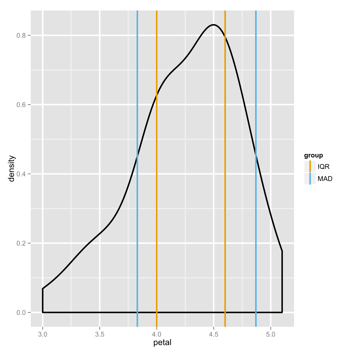
Let’s go back to just using the Gaussian density for now since it’s much easier to read. We can put the measures we developed onto the plot in order to evaluate them. With base R and with ggplot2. Here’s the IQR shown against the density.
plot(density(petal))
abline(v=c(4,4.6), col = '#33CC33')

p <- ggplot(versidf, aes(x = petal))
p + geom_density(size = 1) +
	geom_vline(x = c(4,4.6), size = 1, color = '#33CC33') +
	theme(panel.grid.major = element_line(size = 1),
		panel.grid.minor = element_line(size = .8))

So clearly the IQR is capturing a lot of the density (including the point of highest density) and it does represent a piece of information that is very easy to understand. Unfortunately it isn’t making using of much of the information in the data. Because of this if IQR is not very efficient, it doesn’t generalize very well without a very large sample.
The most popular measures of spread are ones that make use of all of the data points. Of these the most basic is the median absolute deviation. We saw the related concept of the mean absolute deviation in an earlier post when talking about the measures of central tendency. The MAD is the median distance from each data point to the median of the data. Like the median and the IQR the MAD is considered robust, not easily distorted by outliers. It is more efficient than the IQR.
It is somewhat rare to report the strict MAD, though, because the exact number of not of much interest. As a result it is usually scaled to mimic a more popular measure of variability called the standard deviation. With R we can get the strict MAD if we want but it gives us the traditional one by default.
mad(petal)
0.51891

mad(petal, constant = 1)
.35

median(petal)
4.35
For convenience later we will now make a function that gives us x+y and x-y as a conveniently structured dataframe. These sorts of convenience functions are extremely useful if you expect to do something many times.
plusminus <- function(p, q, groups = seq(1,max(length(x),length(y))) ) {
	a <- p-q
	b <- p+q
	c <- c(a,b)
	d <- data.frame(vals = c, group = groups)
	d[order(d$group),]
	}
The code here is very simple, you just have to keep in mind how R treats vectors. There are three arguments: p and q are numeric objects (either scalars or vectors); groups is a vector as the same size as the larger or p and q. In the function itself we subtract p from q, add p to q, and then make all of those results into a single vector. Notice that the vector “c” will contain all of the minus values followed by all of the plus values. Finally we put values into a dataframe along with groups. For the sake of neatness we than order the dataframe so that all of the groups are together.
plusminus(4.35,c(0.52,0.35))
  vals group
1 3.83     1
3 4.87     1
2 4.00     2
4 4.70     2
You can see immediately that, in this case, the strict MAD (group 2) is about the same as the IQR while the traditional MAD is obviously quite different. Let’s compare the traditional MAD with the IQR in an image. We saw the cbPalette vector of color codes a while back, I’ve deleted the first one so that the lines stand out a little better here.
spread <- plusminus(c(4.3,4.35), c(.3,.52), c('IQR','MAD'))
cbPalette <- c("#E69F00", "#56B4E9", "#009E73", "#F0E442", "#0072B2", "#D55E00", "#CC79A7")

p <- ggplot(versidf, aes(x=petal))
p + 	geom_density(size=1) +
	geom_vline(data=spread,
		aes(xintercept=vals,
		color = group),
		show_guide = TRUE, size = 1) +
	scale_color_manual(values=cbPalette) +
	theme(panel.grid.major = element_line(size = 1),
		panel.grid.minor = element_line(size = .8))