Probability Distributions

Probability Distributions

A probability density distribution is an idealized version of the kind of densities we’ve looked at many times before on this blog. Probably the most well known distributions are the uniform distribution and normal (or Gaussian) distributions. Here’s what they look like.

uniformnormal

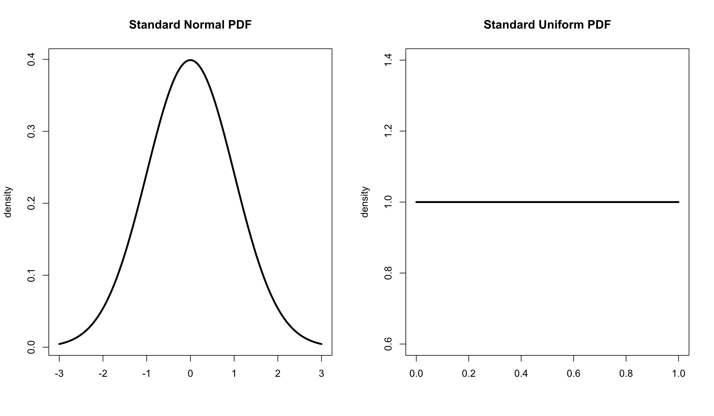
The standard uniform distribution is defined as having a minimum of 0 and a maximum of 1 while the standard normal distribution has a mean of 0 and a standard deviation of 1 (and stretches infinitely in both directions). Each kind of distribution has an equation that uses these characteristics to determine the density at any given point.

The uniform distribution is flat, all values are equally likely (equiprobable), while the normal distribution is bell shaped, values close to the middle are more likely than ones on the tail ends. Reading a probability density requires a small amount of abstract thinking. The density measures how dense that point is, not how probable it is. Probability is shown by area. We’ll get to that later.

It is often said that values are “drawn from” a distribution as if it were an infinitely large deck of cards. For example if you measure the weight of many adults you are drawing from an approximately normal distribution. R can draw random numbers from a lot of different distributions with the ‘r’ type functions (rnorm(), runif(), rgamma(), and so on).

The arguments for these functions require us to define the them in different ways. For the normal distribution we define the mean and and standard deviation, it will draw values in an almost infinitely wide range. For the uniform distribution we simply define the range in which we draw from, since it has no other characteristics. These values are called their parameters.

Here we draw ten values from a standard normal distribution (mean = 0, sd = 1) and from the uniform distribution between 20 and 30. The numbers are rounded off so they’re easier to read.

rnorm(10,0,1)
 -1.00  0.86 -0.46  1.49 -1.77  2.76 -1.48  0.23 -1.83 -0.61
runif(10,20,30)
 26.82 22.77 20.23 24.53 22.79 28.88 28.58 20.38 27.10 23.43

Notice that although the normal distribution could theoretically have values of any size what we find is that most of our random numbers are close to zero. The uniform numbers span the whole possible range. We can take a look at how the samples are spread out with a histogram or a density.


a <- data.frame(dat = runif(10000,0,1))
b <- data.frame(dat = rnorm(10000,0,1))

ggplot(a, aes(x=dat)) + geom_histogram(color='black',fill='black')
ggplot(b, aes(x=dat)) + geom_histogram(color='black',fill='black')

ragged

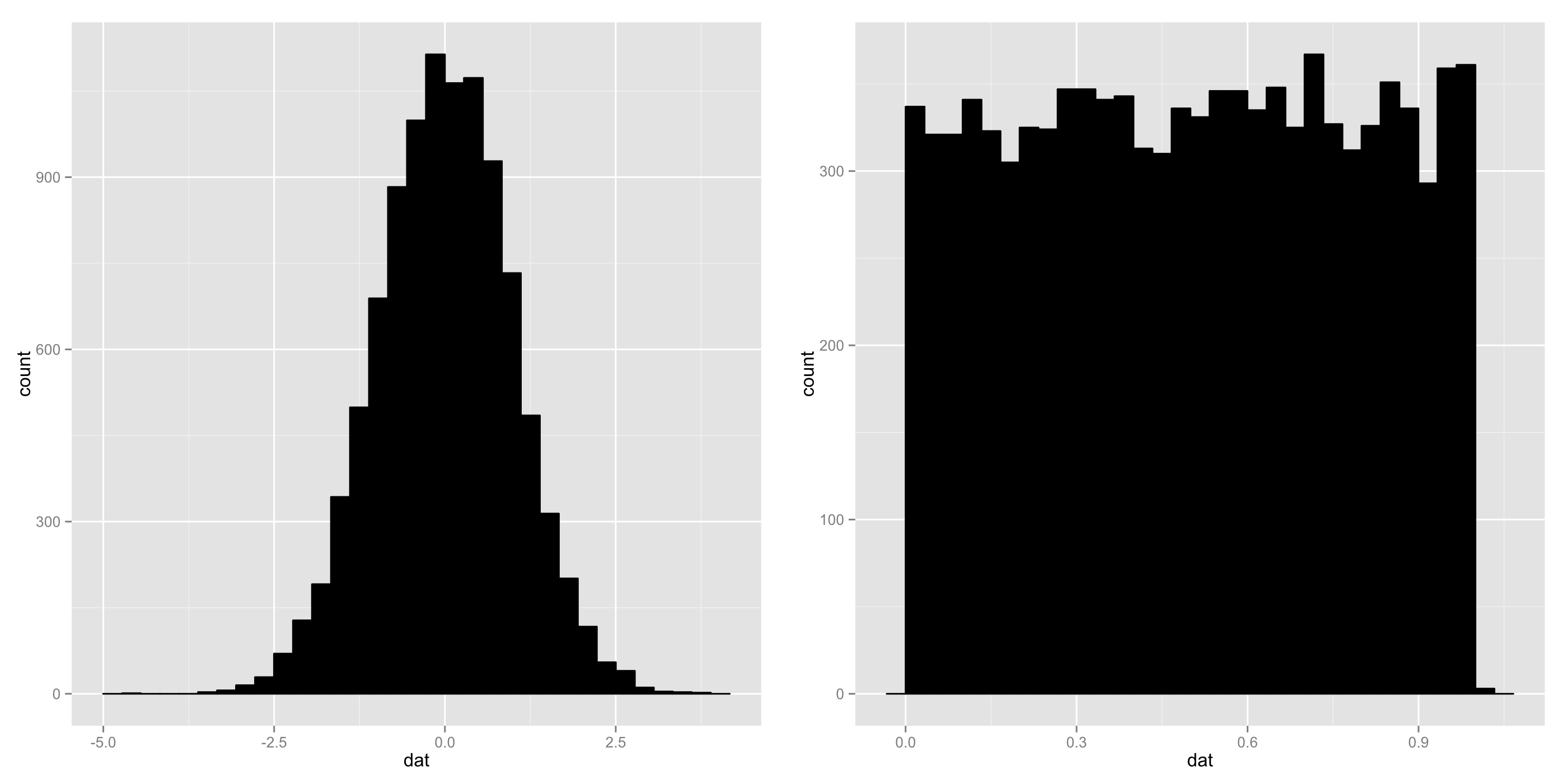
Yep, they look like ragged versions of the idealized distributions they come from.

To estimate the probability of drawing a certain values from a distribution we use can the process of numeric integration to determine the area under the line (to review, we add up the density of a bunch of slices and then divide by the number of slices). What is the probability of drawing a number between -1 and 1 from a standard normal distribution? How about extremely close to the center, between -0.5 and 0.5?

# Total probability of standard normal distribution from -1 to 1.
sum(dnorm(seq(-1,1,.001)))/1001
0.6822492

# Total probability of standard normal distribution from -0.5 to 0.5.
sum(dnorm(seq(-0.5,0.5,.001)))/1001
0.3828941

# Total probability of standard  from 0.3 to 0.72.
sum(dunif(seq(0.3,0.72,.001)))/1001
0.4205794

Notice that we’re off by a bit on each of these because we’re only using 1001 slices, it might be better to use more. You can see this most obviously with the uniform distribution since it is easy to figure out the answer analytically. The probability of getting a number between 0.3 and 0.72 (for a standard uniform which, recall, goes from 0 to 1) is exactly 0.42 since it covers 42% of the range.

A probability distribution can be represented in a variety of ways. The cumulative distribution function, for example, shows the total probability of drawing a given value of lower. It is accessed with the ‘p’ type functions (pnorm(), punif(), pgamma(), and so on).

cumulative

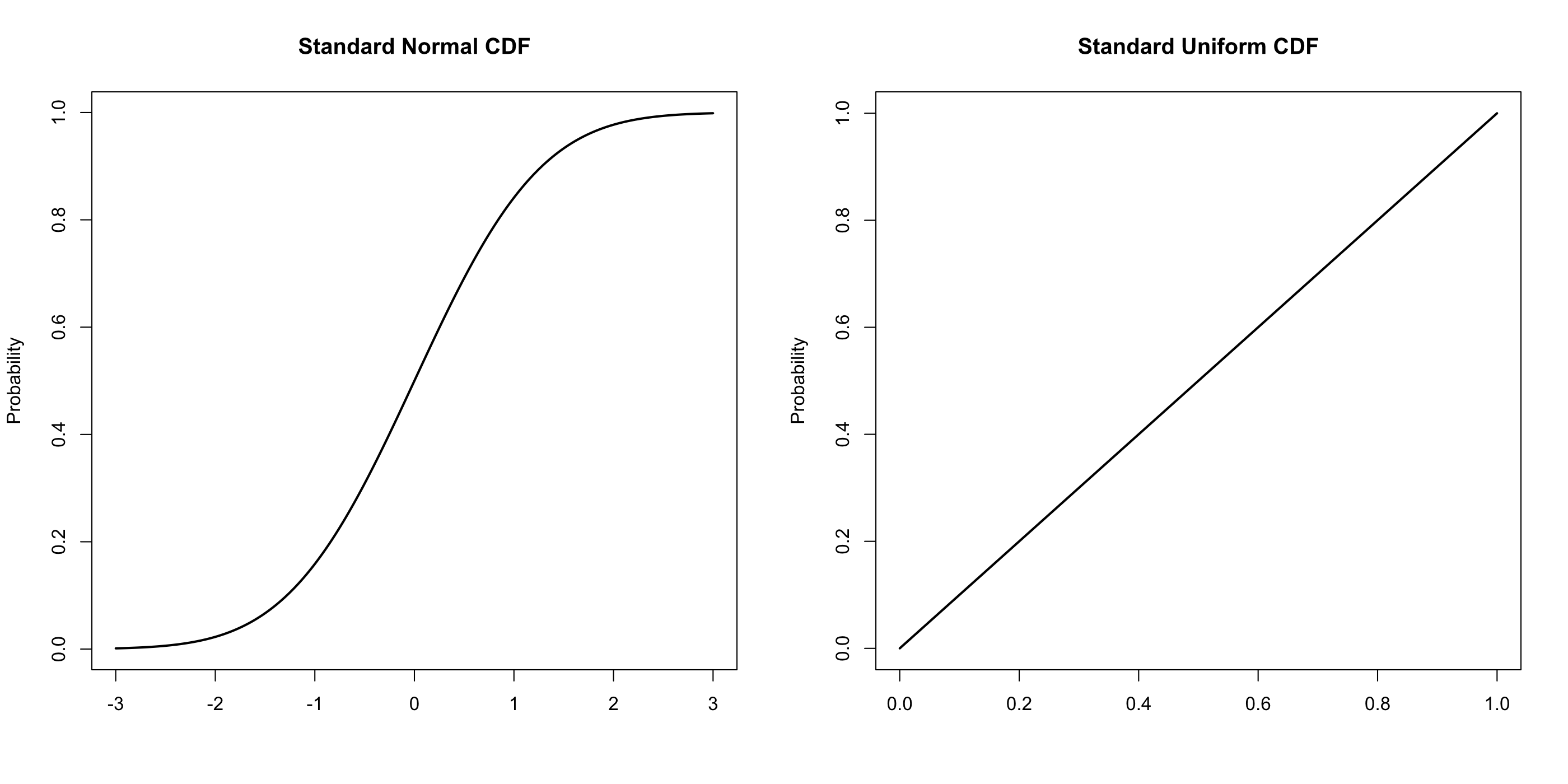
Notice that this is not a density function and it does show probability at each point. The function reaches 0.5 at zero for a standard normal distribution, there is a 50% chance of drawing a value lower than 0.

One last thing before we move on to the next post. For a density function, what is the probability at a given point? That is to say what is the probably of drawing a zero from the standard normal? What is the probability of drawing a three? Not an easy question. We can say that the density at zero is 0.3989 and the density at three is 0.0044 so we can say that drawing a zero is about ninety times as likely. If we squeeze our interval tighter and tighter, though, hoping to determine an exact probability both of them will drop forever toward zero. The probability is infinitesimal, effectively zero.

The purpose of this aside is to reinforce an observation that I’ve made before: It is important to think in terms of intervals rather than point values.

Reporting Mean and SE

Did you know you can put ggplot2 code inside of a function? Even though the grammar is different it is still R code

Before you try it out make a script with the mean.se() function we made last time and save it with the rest of your R code under the name “meanse.R” so we can reference it whenever we want.

Let’s make a function that creates the kind of graphics we’ve been looking at this week. A violin plot and a shaded boxplot are good. I think a dotplot is also worth including, we’ll tell ggplot2 to zoom out to the range of the data so we can see the variability in a reasonable way. As great as graphics are it always responsible to report the exact numbers as well so we want the function to output the summary stats that we’re using as well.

Since this post is all about the function we’ll go through it in pieces then gather it all together at the end.

Our first line defines the function. It will be named report() and show the use where to put the variable column, the grouping column, and to define the type of image. Finally the use can decide what interval size they want.

report <- function(variable, groups, type="violin", int=1) {

To save a lot of typing through the rest of the function I rename variable and group to a and b.

a <- variable
b <- groups

The require() function is like the library() function but it checks if ggplot2 is already loaded. Saves a bit of time when running the function. Meanwhile the source() function will read the script we saved elsewhere.

require(ggplot2)
source("meanse.R")

Now we make two dataframes for ggplot2 to use later on. First we load the variable and the groups into their own dataframe then we use mean.se to extract the mean and standard error for us.

dat <- data.frame(a, b)
datse <- mean.se(a, b, int = int)

This is just a polite line of code that reminds the user they’re showing something other than one SE.

if(int != 1) {
	warning(paste("Showing and reporting",int,"standard errors"), .call = FALSE)
}

Like we’ve done in previous posts we’ll build a ggplot object that contains the base information we want. This way we don’t have to rewrite thd information.

p <- ggplot(data = dat, aes(x=b, y=a)) + 
	theme_bw() + 
	theme(panel.grid.major = element_line(size = 1)) +
	labs(x="Group", y="Variable")

Here we have a very ugly block of code that creates, but doesn’t print, a violin plot. We only want the object created so we can extract the range of the plot. Later on this will be used to help make the dotplot look much neater.

q <- p + geom_violin()
ran <- ggplot_build(q)$panel$ranges[[1]]$y.range

These three if() statements will run depending on what the user sets the ‘type’ argument to. Both the violin plot and boxplot should be familiar. For the dot plot we use the datse dataframe we made to define errorbars and a large dot at the mean.

if(type=="violin") {
	p <- p + geom_violin(size=1) +
		geom_pointrange(data = datse,
			aes(x=group, y=m, ymax=m+se, ymin=m-se),
			size=1)
}
	if(type=="box") {
	p <- p + geom_boxplot(size=1) +
		geom_crossbar(data = datse, 
			aes(x=group, y=m, ymin=m-se, ymax=m+se), 
			color=NA, fill="grey", alpha=.5, width=.75)
}
if(type=="dot") {
	p <- p + geom_errorbar(data = datse,
			aes(x=group, y=m, ymax=m+se, ymin=m-se),
			size=1, width=.3) +
		geom_point(data = datse,
			aes(x=group, y=m),
			size=4) +
		coord_cartesian(ylim=range(ran))
	}

Finally we get to print our graphics. Hooray! We used print() once before and recall that it forces the function to output something without ending the function.

print(p)

The last coding line of he function will be returned as the official output.

datse

Don’t forget to close the function or everything will go wrong.

}

Here’s the whole thing:

report &lt;- function(variable, groups, type=&quot;dot&quot;, int=1) {
	a &lt;- variable
	b &lt;- groups

	require(ggplot2)
	source(&quot;meanse.R&quot;)

	dat &lt;- data.frame(a,b)
	datse &lt;- mean.se(a,b,int=int)

	if(int != 1) {
		warning(paste(&quot;Showing and reporting&quot;,int,&quot;standard errors&quot;), .call=FALSE)
	}
	
	p &lt;- ggplot(data = dat, aes(x=b,y=a)) + 
			theme_bw() + 
			theme(panel.grid.major = element_line(size = 1)) +
			labs(x=&quot;Group&quot;,y=&quot;Variable&quot;)

	q &lt;- p + geom_violin()
	ran &lt;- ggplot_build(q)$panel$ranges[[1]]$y.range

	if(type==&quot;violin&quot;) {
		p &lt;- p + 
			geom_violin(size=1) +
			geom_pointrange(data = datse,
				aes(x=group,y=m,ymax=m+se,ymin=m-se),
				size=1)
	}

	if(type==&quot;box&quot;) {
	p &lt;- p + 
		geom_boxplot(size=1) +
		geom_crossbar(data = datse, 
			aes(x=group,y=m,ymin=m-se,ymax=m+se), 
			color=NA, fill=&quot;grey&quot;, alpha=.5, width=.75)
	}

	if(type==&quot;dot&quot;) {
		p &lt;- p + 
			geom_errorbar(data = datse,
				aes(x=group,y=m,ymax=m+se,ymin=m-se),
				size=1, width=.3) +
			geom_point(data = datse,
				aes(x=group,y=m),
				size=2.5) +
			coord_cartesian(ylim=range(ran))
	}
print(p)
datse
}

You can save this as its own script so you can source() it later.

Let's try it out for ourselves with the <em>iris</em> data. Let's make boxplot of the Sepal Widths and show the 95% confidence interval of the mean (two standard errors).


with(iris,report(Sepal.Width,Species,type='box',int=2))

irisbox

Boxes and Violins

Boxes and Violins

While making this post it occurred to me that its very inelegant to calculate the mean, standard error, and groups the way we’ve been doing it. A simple function will telescope all the work for us and add a bit more functionality.

The argument var will be be the variable we want to know about, group will be the column of the data where the group names are, and int will be the size of the interval (set to one standard error by default but an interval of two standard error is also popular). The output is the standard error, the mean, and the groups.

mean.se <- function(var,group,int=1) {
	se <- tapply(var,group,sd)/sqrt(length(var))
	se <- se*int
	m <- tapply(var,group,mean)
	group <- levels(group)

	data.frame(se,m,group)
}

Much easier to reference later! We’ll get very good use out of it on Friday.

Last time we looked at barplots and dotplots as ways to graphical represent the frequently called for information of the mean and the standard error. Its hard to represent this information more efficiently than either of those methods. As a result the main alternatives aim to represent much more information.

Let's take a look at adaptations of a boxplot and a violin plot.
boxandviolin

In the violin plot we essentially just put a dotplot over the density. In the boxplot we have shaded the range which covers one standard error.

The biggest advantage of these methods, in terms of the standard error, is that they’re not arbitrarily magnified. Both of them force the range of the plot to be approximately the range of the data. Nonetheless they add in the potential pitfalls of their base plots. In particular a violin plot tends to imply that there is a relatively large amount of data so it isn’t really appropriate with only ten data points like we have here.

As advertized they also show a lot more information than a simpler plot would. This is much more useful when the data happens to be skewed or strangely shaped. In that spirit lets check out some data made from a lognormal distribution.

dist <- c(rlnorm(30, .15 , .35), rlnorm(30, .3, .5))
group <- c(rep("a",30),rep("b",30))
dat <- data.frame(dist,group)

boxandviolin2

The data here is radically skewed so having the density or boxplot available is extremely useful compared to just presenting the mean and standard error.

The graphics code.

Thanks to our custom mean.se() function we can streamline the process very nicely. The important thing to keep in mind is that the violin plot and boxplot require sending all of the data to the graphics code. We have to feed it the mean and standard error separately.

For the PlantGrowth data:

plants <- with(PlantGrowth,mean.se(weight,group))

# Create a base with all of the stylistic code we want. Black and white theme with larger lines.
base <- ggplot(PlantGrowth,aes(x=group, y=weight)) +
	theme_bw() +
	theme(panel.grid.major = element_line(size = 1))

# Add a violin layer to the base then a pointrange layer that brings in the new data.
base + geom_violin(size=1) + 
	geom_pointrange(data=plants,a es(x=group, y=m, ymax=m+se, ymin=m-se),
		size=1)

# Add a boxplot layer to the base then a crossbar layer with that brings in the new data.
base + geom_boxplot(size=1) + 
	geom_crossbar(data = plants, aes(x=group, y=m, ymin=m-se, ymax=m+se), 
	color=NA, fill="grey", alpha=.5, width=.75)

For the lognormal data.

# Make some random lognormal data with the rlnorm() function.
# We also define slightly different shapes for them.
dist <- c(rlnorm(30, .15 , .35), rlnorm(30, .3, .5))
group <- c(rep("a",30),rep("b",30))

# Bring the data together into a dataframe.
dat <- data.frame(dist,group)

# Process it
datse <- mean.se(dat$dist,dat$group)

# The same basic code we used before.
base <- ggplot(dat, aes(x=group,y=dist)) +
	theme_bw() +
	theme(panel.grid.major = element_line(size = 1))

base +	geom_violin(size=1) +
	geom_pointrange(data=datse, aes(x=group, y=m, ymax=m+se, ymin=m-se),
		size=1)

base +	geom_boxplot(size=1) +
	geom_crossbar(data=datse, aes(x=group, y=m, ymax=m+se, ymin=m-se),
		fill='gray',alpha=.5,width=.75,color=NA)

On Friday we’ll pull this work together and learn more about making functions with R.

Dots and Dynamite

For this post we’ll be looking at the PlantGrowth data from base R which compares the growth of thirty plants, ten in a control group and ten in each of two experimental groups. The final weight of each plant and the group it was in is recorded in the dataframe.

head(PlantGrowth)
  weight group
1   4.17  ctrl
2   5.58  ctrl
3   5.18  ctrl
4   6.11  ctrl
5   4.50  ctrl
6   4.61  ctrl

Here’s a shockingly contentious question: What is the best way to show the mean weights of the various groups?

There are a lot of answers to this. In many fields a bar plot is used to show the mean with whisker-like error bars to show either the standard error or the standard deviation. The standard error is a way to estimate the true position of the mean.

Let’s take a look at this method, showing the standard error.
meanbar

Here’s the problem with this. Think about what the bar in this graphic is supposed to represent. Have you figured it out? It doesn’t represent anything. Frankly, that’s a problem. In a traditional barplot or histogram that bar is there to represent what we think of as mass, the graphic builds upward from zero, they are like towers where the top is the highest point. The center of data is a pure abstraction, it is not at all like the highest point in a tower.

People who aren’t fans of this method like to call this kind of image a dynamite plot because it looks like an old fashioned detonator box.

A commonly proposed alternative is to use dotplots.

Here’s what a dot version of the same information looks like, again with the standard error.

meandot

Certainly this has an advantage of lacking the meaningless, and potentially confusing, bar. The criticism most frequently leveled at this technique is that it magnified the difference between groups. In fact with ggplot2 (which we are using here) the differences will be shown as large as possible. While it is admittedly true that this should be considered as a problem isn’t clear that anchoring the plot at zero is any better. After all, a barplot with shrink apparent differences between means. Besides, the whole reason that standard error exists is in order to help us make appropriate comparisons.

Making the PlantGrowth data work for us take a little bit of effort. First we need the mean and standard error of each group. We’ll also extract the levels() of the group variable.

se <- with(PlantGrowth,tapply(weight,group,sd))/sqrt(10)
     ctrl      trt1      trt2 
0.1843897 0.2509823 0.1399540

m <- with(PlantGrowth,tapply(weight,group,mean))
 ctrl  trt1  trt2 
5.032 4.661 5.526

group <- levels(PlantGrowth$group)
"ctrl" "trt1" "trt2"

Now we put them all together into a dataframe that ggplot2 can read for us. As a new trick let’s also store all of the stylistic stuff in the name of the ggplot object we make. This makes referencing it later very easy.

plants <- data.frame(weight,se,group)

base <- ggplot(plants,aes(x=group,y=weight,ymax=weight+se,ymin=weight-se)) +
	geom_errorbar(width=.3,size=.8) + 
	theme_bw() +
	theme(panel.grid.major = element_line(size = 1))

base + geom_bar(fill='black')

base + geom_point(size=6)

In our next post we’ll take a look at boxplots and violin plots again. How do they stack up with dotplots and barplots?

More With Tables

Tables can also be used to support graphics in R. A traditional bar plot, showing the total count for each variable, is most easily made by plotting a one dimensional table.

Using the baseball player data from before:

barplot(table(tab$position))

positioncount

If you make a plot of a table that has two or more dimensions you get a mosaic plot, which is very difficult to read.

Tables can also be made multidimensional with the ftable() function, short for “flat table”. Like addmargins() and prop.table() this function only works when applied to an existing table. Here is a three dimensional flat table using the carstuff data.

t <- with(carstuff,(table(safety,class,buying)))
ftable(t)
             buying vhigh high med low
safety class                          
high   unacc           98   75  52  52
       acc             46   69  56  33
       good             0    0  10  20
       vgood            0    0  26  39
med    unacc          118  105  72  62
       acc             26   39  59  56
       good             0    0  13  26
       vgood            0    0   0   0
low    unacc          144  144 144 144
       acc              0    0   0   0
       good             0    0   0   0
       vgood            0    0   0   0

Without using ftable() you still get a similar output from the table, but in a form that’s extremely difficult to read.

Tables

Tables are probably the world’s oldest statistical technique. There are, however, a lot of different kinds of tables. A dataframe is a sort of table itself, of course. A contingency table (also known as a pivot table) shows relationships between two variables by counting up where they overlap.

Lets get some data to work with by using the read.table() function from base R to scrape it off of a source online. The first six variables are traits of the cars and the seventh is how the car was classified (how acceptable it was). For our own convenience lets order the factors as well rather than leave them in alphabetical order.

url <- "http://archive.ics.uci.edu/ml/machine-learning-databases/car/car.data"
carstuff <- read.table(url, sep=",")
names(carstuff) <- c("buying", "maint", "doors", "persons", "lug.boot", "safety", "class")

carstuff$buying <- factor(carstuff$buying, levels=c("vhigh","high","med","low"), ordered=TRUE)
carstuff$maint <- factor(carstuff$maint, levels=c("vhigh","high","med","low"), ordered=TRUE)
carstuff$lug.boot <- factor(carstuff$lug.boot, levels=c("small","med","big"), ordered=TRUE)
carstuff$safety <- factor(carstuff$safety, levels=c("high","med","low"), ordered=TRUE)
carstuff$class <- factor(carstuff$class, levels=c("unacc","acc","good","vgood"), ordered=TRUE)

(The actual page starts with https but R won’t read that properly.)

Here’s a random sample of the dataframe that R made.

carstuff[sample(nrow(carstuff),5),]
     buying maint doors persons lug.boot safety class
500    high vhigh     4       4      med    med unacc
1439    low  high     3       2      big    med unacc
1215    med   low     2    more      big   high vgood
866     med vhigh     2       2    small    med unacc
549    high  high     2       2      big   high unacc

A contingency table showing the relationship between safety and class. This is one of the best ways to report categorical data. You can see immediately that if a car has “low” safety it is always classified as “unacc” (unacceptable). You can also see that the only way to get a “vgood” classification is to have a high safety rating.

t <- with(carstuff,table(safety,class))
t
      class
safety unacc acc good vgood
  high   277 204   30    65
  med    357 180   39     0
  low    576   0    0     0

Tables can be transformed in a variety of ways in R. The addmargins() function can put any sort of margin you want onto a table. The sum of each column and row is a common one.

addmargins(t, FUN=sum)
Margins computed over dimensions
in the following order:
1: safety
2: class
      class
safety unacc  acc good vgood  sum
  high   277  204   30    65  576
  med    357  180   39     0  576
  low    576    0    0     0  576
  sum   1210  384   69    65 1728

This reveals some other things about the data. For example this data is constructed so that everything except class is evenly split between the various levels.

A proportion table can be made with the prop.table() function to show us more explicitly how the data is distributed than the alternatives. The default setting shows us proportions across both dimensions but it can be set to go across just columns or just rows.
And then you can add margins to get more information about that! All of the pieces fit together.

prop.table(t)
      class
safety unacc   acc  good vgood
  high 0.160 0.118 0.017 0.038
  med  0.207 0.104 0.023 0.000
  low  0.333 0.000 0.000 0.000

Summary – Descriptive Statistics Part 3

For the final part of our summary of descriptive statistics lets make a function that ties together everything we’ve learned so far. The great thing about functions in R as teaching tools is that they don’t introduce any new concepts. If you want a refresher functions check out the intro post.

We’ve seen that the mean and median can both be important so we’ll report those. The SD and the MAD are both important measures of variability to be aware of. The minimum and maximum sometimes hold important information, besides showing the edges of the data. We also want to know how many data points we have. Finally we’ve seen that graphics are important so our function should produce those as well.

This new function which we’ll call info has two arguments: na.rm to decide if we want to get rid of missing data (on by default) and draw to decide if the function will produce graphics (off by default).

info <- function(x, na.rm=TRUE, draw=FALSE) {

Since the function really wants a dataframe in order to work properly we make check the class of the data and stop with an error message if it’s wrong.

if(class(x) != "data.frame") {
	stop("Input must be a dataframe.")
}

The descriptive statistics we have don’t work at all on categorical data this next block of code strips out everything except numerics. It also counts how many variables are removed and says so. This is more than just polite, it informs the user about a significant change we’ve made to the dataframe.

lenx1 <- ncol(x)
x <- x[sapply(x, is.numeric)]
lenx2 <- ncol(x)
if(lenx1 != lenx2) {
	print((paste(“Warning”, lenx1-lenx2, “non-numeric variables removed.”)))
}

Enough housekeeping, lets make the function do some real work. Here we start by defining a special function, len, which will count the length of the variable without NAs. Then we use apply() to get descriptions of each individual column. Fortunately for us apply() returns the information with the name of the column included, which will save time later.

len <- function(x) {length(na.omit(x))}
l <- apply(x,2,len)
m <- apply(x,2,mean,na.rm=na.rm)
e <- apply(x,2,median,na.rm=na.rm)
s <- apply(x,2,sd,na.rm=na.rm)
d <- apply(x,2,mad,na.rm=na.rm)
a <- apply(x,2,min,na.rm=na.rm)
z <- apply(x,2,max,na.rm=na.rm)

Now we collect all of that information, put it into a dataframe, and use format to trim things down to a number of digits that will be easy to read. The print() function forces the output to occur before the function is finished.

sumstats <- format(data.frame(
	n = l, 
	mean = m, 
	med = e, 
	sd = s, 
	mad = d, 
	min = a, 
	max = z), 
		digits = 2)
print(sumstats)

Making the plots is actually pretty easy. A scatterplot matrix will be made automatically from the plot() function since our input is going to be purely numeric. All we have to do is give it a good name.

The par() function, which may be new to you, is telling R what to do with graphical objects. In this case it says that R will wait for us to click before continuing.

Using a for() loop produces a density plot of each variable and even gives it the appropriate name. The value of i increases by one with each iteration of the loop.

if (draw) {
	plot(x, main = "Scatterplot Matrix")

	par(ask=TRUE)
	
	for(i in 1:ncol(x)) {
		plot(density(x[,i], na.rm=na.rm), 
			main = paste(names(x)[i]))
	}
}

Don’t forget the final bracket to close the function!

}

The whole thing looks like this:

info <- function(x, na.rm=TRUE, draw=FALSE) {

	if(class(x) != "data.frame") {
		stop("Input must be a dataframe.")
	}

	lenx1 <- ncol(x)
	x <- x[sapply(x,is.numeric)]
	lenx2 <- ncol(x)
	if(lenx1 != lenx2) {
		print((paste('Warning', lenx1-lenx2, 'variables removed')))
	}

	len <- function(x) {length(na.omit(x))}
	l <- apply(x,2,len)
	m <- apply(x,2,mean,na.rm=na.rm)
	e <- apply(x,2,median,na.rm=na.rm)
	s <- apply(x,2,sd,na.rm=na.rm)
	d <- apply(x,2,mad,na.rm=na.rm)
	a <- apply(x,2,min,na.rm=na.rm)
	z <- apply(x,2,max,na.rm=na.rm)

	sumstats <- format(data.frame(
			n = l, 
			mean = m, 
			med = e, 
			sd = s, 
			mad = d, 
			min = a, 
			max = z), 
				digits = 2)
	print(sumstats)

	if (draw) {
		plot(x, main = "Scatterplot Matrix")

		par(ask=TRUE)
	
		for(i in 1:ncol(x)) {
			plot(density(x[,i], na.rm=na.rm), 
				main = paste(names(x)[i]))
		}
	}
}

Let’s try it out with the data we’ve been using the describes baseball players.

info(tab)
[1] "Warning 3 non-numeric variables removed"
          n mean med   sd  mad min max
height 1034   74  74  2.3  3.0  67  83
weight 1033  202 200 21.0 22.2 150 290
age    1034   29  28  4.3  4.1  21  49

A bunch of good stuff is visible here. It tells us that three variables aren’t included in the output. It also shows us that one data point is missing from weight. The output is a dataframe that we can easily read. If we want we can even save it to use later.

Do the graphics work?

info(tab,draw=TRUE)
[1] "Warning 3 non-numeric variables removed"
          n mean med   sd  mad min max
height 1034   74  74  2.3  3.0  67  83
weight 1033  202 200 21.0 22.2 150 290
age    1034   29  28  4.3  4.1  21  49
Waiting to confirm page change...

tabscatter

tabheight

tabage

tabweight

Very good!

Next week we’ll be talking about tables.

Summary – Descriptive Statistics Part 2

There is more information is the dataframe we have named tab than just the weights of the players. We might also want to look at the other information. Let’s get a quick look at the relationships between the three numeric variables of height, weight, and age. If you try using plot() raw in order to get a scatterplot matrix a bunch of errors will occur, you can’t make a scatterplot of data that isn’t numeric.

Fortunately we can extract just the numeric variables.

plot(tab[,c(4,5,6)])

baseballmatrix

All we see here is a slight positive relationship between height and weight. Taller players tend to weigh more. One thing that scatterplots have trouble with is called overplotting which happens when two points are identical or very close together. Overplotting can make it difficult to see where the data clusters.

There are a few ways to death with this:

One very aesthetically pleasing option is to carefully design bubble plot that merges nearby points into large ones.

More simply we could “jitter” the points, make all of them move a small random distance. Points that are close or identical now fill a space.

In the same vein we might make the points translucent, the darker areas would then be where many points overlap. This turns out to be computationally taxing and not very easy to read.

Finally we could make a two dimensional histogram. Since the bins can’t show height we use color instead.

Let’s take a look at these options and then decide how we might want to describe the data. The ggplot2 code will appear at the end of the post.

A two dimensional histogram is easy to make with just our basic data at the geom_hex() layer in ggplot2. It has to be tuned a bit, though. The bin argument tells R the function how many hexes wide each axis is. I like to use square numbers to find a good number of bins. Here is how it looks with 9, 16, and 25 hexes.

hexbins

I think 16 is about right.

A jittered plot is also easy to make with ggplot2 since it has its own layer, geom_jitter.

jitter

The results are not very impressive. While the striations in the height data are removed, it has only unit values in a narrow range, the jittering ends up showing us the striations in the weight data! It’s a mess that isn’t worth trying to clean up here. A translucent plot is even worse.

The kind of bubble plots we want doesn’t come built in to R. Thankfully the brilliant Nina Zumel has a function that does most of the work for us.

bplot_stats = function(xcol, ycol) {
  nrows = length(xcol)
  ymeans = aggregate(ycol, by=list(xcol), FUN=mean)
  xcounts = aggregate(numeric(nrows)+1, by=list(xcol), FUN=sum)
  data.frame(x = xcounts$Group.1, wt = sqrt(xcounts$x), y=ymeans$x)
}

What it does is find the mean value of y for each x and compress all of the points into a single bubble. Since height and weight have an obvious relationship let’s compare age and weight instead. We will have to do a little work first. Age needs to be discretized in order to work since it was recorded down to the hundredth of a year. Let’s convert it to tenths of a year with the cut() function.

breaks <- seq(20,50,.1)
agedisc <- cut(tab$age, breaks=breaks)

The output of cut() is always a factor so we need to make it into a numeric.

levels(agedisc) <- breaks
agedisc <- as.numeric(as.character(agedisc))

Now we can feed it into the bplot_stats() function. Here’s what the resulting dataframe looks like.

ageweight <- bplot_stats(agedisc, tab$weight)

str(ageweight)
'data.frame':   187 obs. of  3 variables:
 $ x : num  20.8 21.4 21.5 21.7 21.8 22 22.1 22.2 22.3 22.4 ...
 $ wt: num  1 1 1.41 1 1.41 ...
 $ y : num  225 205 195 210 196 ...

Obviously x is x and y is y while wt will be the size of the bubble. Here’s what it looks like.

bubble

The relationship between the age of players and their weight (namely that there’s isn’t one) and how they’re distributed is much more obvious than it was on the ordinary scatter plot.

The ggplot2 code used for graphics:

p <- ggplot(tab)

# jitter plot
p + geom_jitter(aes(x=weight,y=height))

# three different hexbins
p + geom_hex(aes(x=weight,y=height),bins=9) + 
	theme(legend.position="none") + labs(title = "Nine Bins")
p + geom_hex(aes(x=weight,y=height),bins=16) + 
	theme(legend.position="none") + labs(title = "Sixteen Bins")
p + geom_hex(aes(x=weight,y=height),bins=25) + 
	theme(legend.position="none") + labs(title = "Twenty Five Bins")

# Making a bubbleplot
breaks <- seq(20,50,.1)
agedisc <- cut(tab$age, breaks=breaks, include.lowest=TRUE)
levels(agedisc) <- breaks
agedisc <- as.numeric(as.character(agedisc))
ageweight <- bplot_stats(agedisc, tab$weight)

q <- ggplot(a, aes(x=x,y=y,size=wt))
q + geom_point() + labs(x="Age", y="Weight") + theme(legend.position="none")

Summary – Descriptive Statistics

There are many more descriptive statistics than we’ve discussed so far with the measures of central tendency and the measures of spread but the most important and most common techniques have been covered. In the last post we acquired some data from the internet that I know very little about. Let’s use what we’ve learned in order to get an understanding of it.

The best place to start is with the str() and summary() functions. We used str() last time to get an idea of what data we have. It describes 1034 baseball players by name, team position, height, weight, and age.

summary(tab)
     name                team                 position       height    
 Length:1034        NYM    : 38   Relief_Pitcher  :315   Min.   :67.0  
 Class :character   ATL    : 37   Starting_Pitcher:221   1st Qu.:72.0  
 Mode  :character   DET    : 37   Outfielder      :194   Median :74.0  
                    OAK    : 37   Catcher         : 76   Mean   :73.7  
                    BOS    : 36   Second_Baseman  : 58   3rd Qu.:75.0  
                    CHC    : 36   First_Baseman   : 55   Max.   :83.0  
                    (Other):813   (Other)         :115                 
     weight           age       
 Min.   :150.0   Min.   :20.90  
 1st Qu.:187.0   1st Qu.:25.44  
 Median :200.0   Median :27.93  
 Mean   :201.7   Mean   :28.74  
 3rd Qu.:215.0   3rd Qu.:31.23  
 Max.   :290.0   Max.   :48.52  
 NA's   :1

The most important things we see here are that:
a) The teams are equally represented
b) The positions are not equally represented
c) Height, weight, and age have their mean and median close together, which is usually a good sign.
d) There is one missing value for weight!

That last one is especially important since R will return an error if it encounters an NA while doing math. We can order R to remove NAs if we want.

sd(tab$weight)
NA
sd(tab$weight, na.rm=TRUE)
20.99149

Since there is only a single missing value we should probably just drop that line rather than include na.rm=TRUE over and over again. The is.na() function will find where our missing data is. We want the subset of tab where it is FALSE that data is missing.

tab <- tab[is.na(tab$weight) == FALSE,]

The summary() function already showed us the mean, median, and quartiles of the player’s weights. Let’s look at the MAD and the SD.

sd(tab$weight, na.rm=TRUE)
 20.99149

mad(tab$weight, na.rm=TRUE)
 22.239

How would we, in colloquial terms, describe the weights of the players? Probably something like “According to this sample baseball players tend to weight around 200 pounds, give or take twenty pounds”. We lose a lot of precision here but its much easier to understand.

If our goal is to report the data, however, we need to do the best job we can. A traditional option would be along the lines of “This sample of baseball players (N=1033, one missing value excluded) had a mean weight of 201.7 pounds (SD = 21)”. A better option, if we have the space for it is a visualization. Since weight is continuous a density is appropriate.

players

How about if we divide things up by position? A boxplot or violin plot is a good way to look at the information that way. A boxplot gives us the most information. Median, IQR, and any outliers.

playerpos

There’s just one problem with using a boxplot (or even a violin plot) here. The positions don’t all have the same number of players.

with(tab,tapply(position,position,length))
          Catcher Designated_Hitter     First_Baseman        Outfielder 
               76                18                55               194 
   Relief_Pitcher    Second_Baseman         Shortstop  Starting_Pitcher 
              315                58                52               221 
    Third_Baseman 
               45 

There were only 18 Designated Hitters and there were 315 Relief Pitchers. Most plots will disguise that fact. A dotplot won’t, although it lacks much of the information that other methods offer.

playerposdot

Ah, now we see something truly strange about this data. There are striations. Look at how a few values have far more data points than the ones around them. If you look even more closely its visible that these striations happen on multiples of five.

What’s going on? That’s not random! Multiple of five are not important to nature. This is obviously an effect created by human beings. Yet we do have data points in between.

If you track down where this data came from you’ll find that it’s compiled from more than one source. Evidently some of these sources recorded weights only as multiples of five and others as any unit value.

Next time we’ll take a look at some of the other data we have in the dataframe and examine the data across multiple variables.

Here we see the code to make the images in this post with Hadley Wickham’s ggplot2 package.

p <- ggplot(tab)
p + geom_density(aes(x=weight), size=1) +
	theme(panel.grid.major = element_line(size = .8),
		panel.grid.minor = element_line(size = .8))

p + geom_boxplot(aes(x=position,y=weight)) +
	theme(panel.grid.major = element_line(size = .8),
		panel.grid.minor = element_line(size = .8),
		axis.text.x = element_text(angle=45,vjust=.6))

p + geom_dotplot(aes(x='identity',y=weight),binaxis="y",stackdir="center",binwidth=1) +
	theme(panel.grid.major = element_line(size = 1),legend.position="none") +
	scale_y_continuous(minor_breaks=NULL)

Simple Webscraping

Now that we’ve spent a significant amount of time on descriptive statistics its time we took a look at some data we don’t know anything about and see what we can figure out.

Analyzing information about sports, particularly baseball, is a proud tradition in statistics. Unfortunately I don’t know much about baseball. We’re going to use information about the heights and weights of a bunch of baseball players. In order to do so we have to get that data. Right now it’s in a table on a website.

The data is currently stored in a table here:
http://wiki.stat.ucla.edu/socr/index.php/SOCR_Data_MLB_HeightsWeights

There are a few ways to get at this data.

First you can copy and paste the table in to a program like Excel and then load that data into R. I’ve done this and, if the site moves or is taken down, you get get a .csv file with the data in a google doc I made.

For simple data this is probably the easiest way. It takes just a few seconds. Copy – Paste – Save As.

There are times, however, when an alternative process known as webscraping is more effective. Let’s take the chance to webscrape this simple dataset. The XML package by Duncan Temple Lang provides a bunch of useful tools.

First we store the address of the site as an object in R then we use the htmlParse() function to get all of the HTML code from the page.

site <- "http://wiki.stat.ucla.edu/socr/index.php/SOCR_Data_MLB_HeightsWeights"
site.doc <- htmlParse(site)

It happens that there are three tables on that page and trying to read the whole thing directly produces some crazy results. Fortunately, we can extract each table separately since the HTML code specifies where each one begins and ends.

tableNodes = getNodeSet(site.doc, "//table")

The final steps are to read the data clean it up. With the readHTMLTable() function from the XML package we can convert the HTML code into a dataframe. In that command we need to tell it the correct class for each column.

tab <- readHTMLTable(tableNodes[[2]], 
	colClasses = c("character","factor","factor",
		"integer","integer","numeric"),
	stringsAsFactors=FALSE)

After we have the dataframe we need to rename the variables everything. Why? Because tables aren’t designed like dataframes. We can use the names() function to see just how bad it is. We’ve got spaces in the names of all of them, height and weight have parenthesis that will cause confusion, and the age variable actually contains a bit of code in its name that tells R to make a new line.

Madness!

Easily rectified madness!

names(tab)
[1] " Name "           " Team "           " Position "       " Height(inches) "
[5] " Weight(pounds) " " Age\n"
names(tab) <- c('name','team','position','height','weight','age')

str(tab)
'data.frame':   1034 obs. of  6 variables:
 $ name    : chr  "Adam_Donachie" "Paul_Bako" "Ramon_Hernandez" "Kevin_Millar" ...
 $ team    : Factor w/ 30 levels "ANA","ARZ","ATL",..: 4 4 4 4 4 4 4 4 4 4 ...
 $ position: Factor w/ 9 levels "Catcher","Designated_Hitter",..: 1 1 1 3 3 6 7 9 9 4 ...
 $ height  : int  74 74 72 72 73 69 69 71 76 71 ...
 $ weight  : int  180 215 210 210 188 176 209 200 231 180 ...
 $ age     : num  23 34.7 30.8 35.4 35.7 ...

And now we have a beautiful dataframe that is just like anything else we’ve ever seen.

Next time we’ll get around to checking out what the data tells us about the players.