The Z-Test

The z-test, like the binomial test, is a way of testing a hypothesis. It is not a very common form of hypothesis test because it requires us to have a great deal of information we do not usually have but it is an illustrative example that will serve as a stepping stone on the way to the t-test which has more practical applications.

In order to perform a z-test we need to know the the variance of the population that the sample is drawn from. This is not an easy thing to determine in practice.

Many IQ tests are tuned to produce a precise degree of variance when tested on the general population, one of the few somewhat real world examples of an instance where we can use a z-test. Imagine that we are using a test that is designed to have a standard deviation of 10 and a mean of 100. We give this test to 11 people who are supposed to be very clever. Their mean score is 107. The standard error should be:

se <- 10/sqrt(11)
se
 3.015113

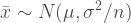
Now that we know the standard error we can calculate the z-score in order to draw conclusions about the data we then determine. This is a form of normalization except we are adjusting for variability in the means rather than variability in the data itself. Thanks to the central limit theorem we believe that the mean values of a sample will follow a normal distribution.

z <- (107-100)/se
z
 2.321637

In a literal sense the z-score is how many standard errors from the population mean our sample mean is. This value is now compared to the standard normal distribution (also know as the z-distribution hence the name!) exactly the way we did with the binomial distribution.

1-pnorm(z)
 0.01012624

So there is about a 1% chance of getting a value as large or larger than the one we found and about a 2% chance of getting a value as extreme or more extreme. Generally we would be comfortable concluding that these people are, in fact, better at taking IQ tests than most people.

Standard Error

We’ve used the standard error several times on this blog without going into much detail about it. In simplest possible terms the SE is the range within which we expect a value (typically the mean) to be. Specifically it is the standard deviation of the sample means.

This requires a bit of abstract thought. If you take many samples from a population you will not always get the same mean value. After taking many samples you’ll have a distribution of those means. We are attempting to describe the characteristics of something one step more abstract than the mean. To see a more concrete example refer to the post of efficient estimators.

When we say “the average weight of a baseball player is 200 pounds” we mean that in our sample the average weight is 200 pounds and that we believe this is close to the true average of the population. With the standard error, confidence interval, or credible interval we quantify how close we expect it to be.

Using our baseball player data from a while back, let’s look at how the standard error works in an ideal situation. We know the true mean of the population so let’s take a bunch of random samples and see how often we capture the true value of the mean.

For convenience make the weight its own object:

weight <- tab$weight

Here is the equation that defines the standard error, first in common notation and then as a custom R function.

\displaystyle se = \frac{s}{\sqrt{n}} = \frac{s^2}{n}
. . . where s is the sample standard deviation (s2 is the sample variance) and n is the sample size.

se <- function(x) {sd(x)/sqrt(length(x))}

Now we use replicate() and sample() to take 1000 samples of 100.

r <- 1000
size <- 100
samps <- replicate(r,sample(weight,size))

Using the apply() function we get the mean and standard error of each sample.

means <- apply(samps,2,mean)
ses <- apply(samps,2,se)

se.h <- means+ses
se.l <- means-ses

Add up all of the instances where the top of the interval is less than the mean or the bottom of the interval is more than the mean. These are the instances where the standard error has missed the true value.

a <- sum(length(se.h[se.h < 201.6893]),length(se.l[se.l > 201.6893]))
1-a/r
 0.709

That’s actually better than we should expect. Keep in mind that the calculation of the standard error relies on us assuming a normal distribution for the population.

So where does the this equation come from?

As you saw before we calculate the standard error as the standard deviation divided by the square root of the sample size or, perhaps more intuitively, the variance divided by the sample size.

We do this because of the Bienayme formula which provides that the sum of the variance of several variables is the same as the variance of the sums of those variables (ie you draw 10 numbers from two populations and add together each pair).

Consider the equation that defines the mean for some data X:
\displaystyle \sum_{i=1}^n x_i/n

Now imagine a sample of exactly one value. The mean is equal to that value (itself divided by 1) and the variance of those means is exactly the population variance. When we draw a large number of values we can treat our sample as many samples of one (which it is), so then the variance of the sum is the same as the variance of the sample (which is approximately equal to the variance of the population).

This is not a rigorous mathematical proof, of course, the intention is to understand the intuition of why the standard error is the way it is. Personally, I find it comforting to know that the standard error is not produced out of thin air.

Normalization

Here’s a simple but common problem: How do you compare two groups that have different scales?

Imagine we are giving assessment tests to several school classes but all of them have been designed differently. Test A ranges from 0 to 100, in increment of a tenth of a point. Test B only offers scores between 0 and 12. Finally Test C is scored between 200 and 800 for arcane reasons known only to the designers. Here is the data we collected, they can all be copied directly into R.

a <- c(69.6, 74.8, 62.7, 54.2, 66.8,
	48.7, 48.7, 67.8, 69.1, 85.1,
	51.2, 54.6, 53.9, 56.4, 51.5,
	73.5, 53.4, 76.1, 60.5, 62.7,
	54.9, 66.8, 54.3, 49.2, 57.3,
	61.3, 61.8, 70.4, 51.1, 53.4)
b <- c(3, 5, 5, 6, 7,
	4, 6, 8, 5, 4,
	5, 5, 6, 6, 5,
	4, 5, 7, 6, 6,
	2, 5, 5, 0, 6,
	5, 4, 5, 6, 4)
c <- c(560, 529, 593, 607, 627,
	597, 544, 531, 584, 510,
	420, 543, 577, 623, 531,
	598, 508, 555, 642, 490,
	596, 626, 597, 514, 602,
	569, 635, 551, 518, 617)

group <- c(rep('a',30),rep('b',30),rep('c',30))

These aren’t easy to make comparisons between the three classes because the tests have such radically different scales. We can look at the descriptive statistics to see how unhelpful the raw data is for purposes of comparison.

mean(a); mean(b); mean(c)
[1] 60.72
[1] 5
[1] 566.46

sd(a); sd(b); sd(c)
[1] 9.46
[1] 1.53
[1] 51.03

Personally I think it’s much funnier to plot the distributions.

dat <- data.frame(group = group, score = c(a,b,c))

p <- ggplot(dat,aes(x=score,color=group))
p + geom_density(size=2) + 
	xlab('score')

normalizeRawData

Yeah, not helpful.

One method of normalization is simply to report the percentage score, this is called non-dimensional normalization since it makes no assumptions about the data. To do this we subtract the minimum possible score and divide by the maximum possible score.

aa <- (a-0)/100
bb <- (b-0)/12
cc <- (c-200)/800

dat <- data.frame(group = group, score = c(aa,bb,cc))

p <- ggplot(dat,aes(x=score,color=group))
p + geom_density(size=2) + 
	xlab('normalized score') + 
	scale_x_continuous(limits=c(0,1))

Now that they are all on a common scale we can visually compare them.

normalizeProp

Notice that the shape of the distributions has not changed (you can see this most clearly with group a). Now we can make some actual meaningful comparisons.

mean(aa); mean(bb); mean(cc)
[1] 0.607
[1] 0.416
[1] 0.458
sd(aa); sd(bb); sd(cc)
[1] 0.094
[1] 0.127
[1] 0.063

The most popular form of dimensional normalization is the z-score or standard score which forces the data into having certain characteristics of a standard normal distribution. Creating a z-score is done by transforming the data so that mean equals 0 and the standard deviation equals 1. This is actually pretty easy to do. For each data point we subtract the mean and divide by the standard deviation.

# We make a function of our own to do it quickly.
normalize <- function(x) {
	(x-mean(x))/sd(x)
}
aa <- normalize(a)
bb <- normalize(b)
cc <- normalize(c)

This isn’t as immediately intuitive as calculating a percentage but it does have some advantages. One immediately advantage is that if a z-score is less than 0 that means the score is worse than average for the group and if the z-score is more than 0 it is better than average.

dat <- data.frame(group = group, score = c(aa,bb,cc))

p <- ggplot(dat,aes(x=score,color=group))
p + geom_density(size=2) + 
	xlab('normalized score')

normalizeZScore

Z-scores are used to compute p-values as part of the Z-test. We will use the Z-test as a lead in to the t-test.

Normalization is also the term used for taking a distribution and ensuring that it integrates or sums to 1, thus becoming a probability distribution. In fact this process is so important that several probability distributions are named after the function that normalizes them like the binomial distribution, the gamma distribution, and the beta distribution.

Central Limit Theorem – Again

A lot of decisions made in statistics rely on the central limit theorem. While the CLT is a bit abstract it is important enough that time should be taken to understand it. It goes like this:

The characteristics of independent samples from a population are approximately normally distributed.

It is important to note that this refers to the distribution of samples, not of the data itself (while many processes are normally distributed this is essentially a side effect of the above statement). This fact about samples is very useful because, as we saw when we looked briefly at the normal distribution, this means it is rare for sample values to dramatically from the population.

For example, the mean height of an American is about 162 centimeters. Even though there are three hundred million citizens it should be difficult to make a random sample of fifty people which has mean height of 100 centimeters.

What’s interesting and significant is that the CLT works with most distributions, you can estimate the mean even of strangely shaped data. Indeed this is so common that distributions that are exceptions, like the Cauchy distribution are considered “pathological”.

Before we continue let’s look at samples from a few different distributions.

# A population of ten thousand for the gamma, uniform, normal, and cauchy distributions.
gam <- rgamma(10000,1)
uni <- runif(10000)
nor <- rnorm(10000)
cau <- rcauchy(10000)

# The true mean of each population.
mg <- mean(gam)
mu <- mean(uni)
mn <- mean(nor)
mc <- mean(cau)

# We take a sample of fifty from each population one thousand times with a quick function.
samp.means <- function(x,rep=1000,n=50) {
	density(colMeans(replicate(1000,sample(x,n))))
}

pgam <- samp.means(gam)
puni <- samp.means(uni)
pnor <- samp.means(nor)
pcau <- samp.means(cau)

First we’ll visualize the shape of the distributions.

distributions

Now we visualize the shape of sample means, a vertical line shows the location of the true mean (the value we want to get).

CLT

For the first three the sample means stay close to the true mean even though they are very different in shape. For the Cauchy the samples have means that are all over the place, although the density happens to be highest near the true mean. Fortunately pathological distributions like the Cauchy are extremely rare in practice.

We talked about this before but we’re taking a second look at it again as part of a series that will lead to the t-test. There are actually a number of different central limit theorems. For example, one of the central limit theorems tells us that for normally distributed variables . . .
\displaystyle \bar{x} \sim N(\mu , {\sigma}^{2}/n)

Which is to say that the sample mean, xbar, for a sample of size n, is distributed as a normal distribution with a mean of μ and a variance of σ2 divided by the sample size. The Greek letters indicate characteristics of the population.

A formal proof of the behavior of samples from a normal distribution is available from PennState.

The fact that the central limit theorems are true is an extremely important result because they tell us a) that a sample will tend to be centered on the population mean and that b) it will tend to be relatively close. Moreover the

It is easy to demonstrate that the CLT is true but there is no immediately intuitive way to explain why the CLT is true. Nonetheless let’s use R to see this occur visually by looking at two trivial cases.

First imagine what happens with a sample of 1. The result of many samples will just be that we draw an identical distribution, one point at a time.

Now if we consider a taking a sample of 2 it is less obvious what will happen but we can write some code for an animation that will give us some idea.

x <- NULL
for(i in 1:50) {
	r <- rnorm(2)
	x[i] <- mean(r)
	h <- hist(x,plot=F,
		breaks=seq(-4,4,.25))
	
	comb <- seq(-4,4,.1)
	ncur <- dnorm(comb)

	title <- paste0('image',i,'.svg')
	svg(title)
	par(mfrow=c(2,1))
	plot(ncur~comb,type='l',xlab='')
	points(dnorm(r)~r,col='red')
	plot(h$counts~h$mids,type='h',
		xlim=c(-4,4),ylim=c(0,10),
		xlab='Mean',ylab='Count',
		lwd=3,col='red')
	dev.off()
}

histogram

We choose two values, compute the mean, and record it. Then repeat that process many times to slowly build up a distribution of means.

Big Sigma and Big Pi

In this post we will look at some familiar mathematical notation in order to make it possible to read formulas we come across. I have assumed that the reader is familiar with how addition, multiplication, subtraction, division, and exponentiation are represented and what they mean. They will be the building blocks of other kinds of notation.

In a previous post we learned about the binomial coefficient and consequently what the factorial function is. There are lots of unfamiliar sorts of notation in mathematics, though.

Today we will look at the summation and product functions, represented by the big sigma and big pi notation. They’re frequently found in formulas. Let’s take a look at them.

Big Sigma
\displaystyle \sum_{a=i}^{n}(a)

Big Pi
\displaystyle \prod_{a=i}^{n}(a)

The notation indicates that we take each value of a from the initial value at the bottom straight through to the maximum value n, do the equation in parenthesis, and then either add together the results or multiply together the results.

It is easier to follow if we expand them.

Here is summation expanded to simple addition.
\displaystyle \sum_{a=0}^{4}(a) = 0+1+2+3+4 = 10

Now summation that involves an actual equation.
\displaystyle \sum_{a=0}^{4}(a^2-3) = (0^2-3)+(1^2-3)+(2^2-3)+(3^2-3)+(4^2-3)
. . . which becomes . . .
\displaystyle \sum_{a=0}^{4}(a^2-3) = (-3)+(-2)+(1)+(6)+(11)
. . . which becomes . . .
\displaystyle \sum_{a=0}^{4}(a^2-3) = 13

Exactly the same thing is done with the big pi symbol.

Kinds of Numbers

There are a lot of different sets of numbers. In this post we will look at some of the more important numbers. Each set of numbers is represented by a single letter in the Blackboard Bold font.

\displaystyle \mathbb R

The real numbers (represented with a fancy R) are all of the numbers most people can easily think of. Anything that can be represented as a decimal is a real number even transcendental numbers like π or √2 that have an infinite number of places.

For example: 0, 2.719, -0.5, 1.333, 10006

Seriously, pick a number. Unless your familiar with some of the stranger realms of mathematics its going to a real number.

We describe as “real space” or “coordinate space” any position that can be described in terms of real real numbers. The numberline is R1 space. Cartesian coordinates are R2 space. Our universe has three dimensions of real space so it is R3 space.

\displaystyle \mathbb Q

The rational numbers (represented with a fancy Q) are all of the numbers which can be represented in terms of a ratio or fraction. All of the rational numbers are real numbers.

For example: 1/1, 5/7, 8/1, 0/1

\displaystyle \mathbb Z

The integers (represented with a fancy Z) are the whole numbers, both positive and negative.

For example: -5, 0, 11, 54, -10

All of the integers are real numbers and rational numbers (every integer can be represented as fractions of the form x/1).

\displaystyle \mathbb N

The natural numbers (represented with a fancy N) are either the positive integers or the non-negative integers. That is, every whole number from 1 to infinity or from 0 to infinity.. Sometimes these are called the “counting numbers” because they are how we count objects. You can have two things or three things but you can’t have -1 things or 1.2 things (a fifth of an apple is a different thing than an apple in this mode of thinking).

All of the natural numbers are real numbers, integers, and rational numbers.

Since there are two popular definitions of the natural numbers they are usually specified. I will try, on this site, to use N0 and N1.

N1 is 1, 2, 3, 4 . . . (the positive integers)
N0 is 0, 1, 2, 3 . . . (the non-negative integers)

Natural numbers show up frequently when discussing discrete events. For example the Poisson distribution has values or “support” only at the N0.

\displaystyle \mathbb I

Here’s where things really get weird.

The imaginary numbers (represented with a fancy I) are the numbers which, when squared, produce a negative. Why are these imaginary? Because they exist outside of the real numbers. There are formal proofs of this but feel free to try finding a real number that has a negative square.

The imaginary unit, which is the equivalent of 1 for the imaginary numbers, is written as i. All of the imaginaries can be represented in the form ri where r is a real number.

The imaginary number line exists perpendicular to the real number line. You might think that imaginaries and the reals never meet but consider the imaginary number 0i. An imaginary times zero is . . . yes, zero. The two lines must then intersect at zero.

Despite being called imaginary these numbers do exist, they just don’t represent any sorts physical things. Imaginary numbers see use in many different contexts.

\displaystyle \mathbb C

The complex numbers (represented with a fancy C) are the numbers which can be represented as the sum of a real number and an imaginary number. Complex numbers do no exist on a line, their simplest form is in two dimensions which is referred to as the complex plane.

This set contains all of the real numbers. For every real number x there is a corresponding complex number of the form x+0i.

Weird Facts from MTG JSON – Art

Welcome back to my irregular series Weird Facts from MTG JSON, using data made available by Robert Shultz on his site.

It is a truth universally acknowledged that the Magic creative team tends to give cards a dominant color scheme that corresponds to their Color. How can we test this this hypothesis?

The mtgimage site provides easily available images of the art for every card. There are far too many cards to practically apply this method to the whole history of the game so we’re going to take a look at a limited section of them. Since the core sets have no particular theme I expect they’ll be less influenced by the artistic tone of a given block.

Between them the last several core sets have more than one thousand cards. We will adapt some code from the is.R() blog on tumblr to extract the images.

library(jpeg)
library(RCurl)
library(MASS)

a <- AllCards[AllCards$set == 'M10',]
b <- AllCards[AllCards$set == 'M11',]
c <- AllCards[AllCards$set == 'M12',]
d <- AllCards[AllCards$set == 'M13',]
e <- AllCards[AllCards$set == 'M14',]
f <- AllCards[AllCards$set == 'M15',]

l <- rbind(a,b,c,d,e,f)

w <- l[l$color == "W",]
u <- l[l$color == "U",]
b <- l[l$color == "B",]
r <- l[l$color == "R",]
g <- l[l$color == "G",]

l <- rbind(w,u,b,r,g)

code <- l$ID

urls <- paste("http://mtgimage.com/multiverseid/",codes,"-crop.jpg", sep="")

Running the actual extraction takes a while but we only have to do it once.

jpglist <- list()
for (i in 1:length(urls)) {
	jpglist[[i]] <- readJPEG(getURLContent(urls[i]))
}

This next complicated bit of code comes again from the is.R() blog. You can read more about it there. The idea is that is the color information from the raster image is can be averaged in order to produce coordinates in color space.

meanRGB <- t(sapply(jpglist,function(ll) {
	apply(ll[,,-4],3,mean)
}

cardDistance <- dist(meanRGB)
cardDistance[cardDistance <= 0] <- 1e-10
MDS <- isoMDS(cardDistance)$points

Bind the color and name of each card to its position in color space then save the data so we don’t have to run the loop in the future.

col <- as.character(l$color)
name <- l$name
posCol <- data.frame(MDS,col,name)

save(posCol,file="posCol.Rdata")

There is now a file in R’s working directory called posCol.Rdata which you can load directly into R with the load() function.

Then we make a simple scatter plot and make all the colors line up with appropriate Colors. The goal here is simply to be able to identify clustering if there is any. In order to deal with the fact that the cards are ordered by color we’ll randomize them.

posCol <- posCol[sample(nrow(posCol)),]

p <- ggplot(posCol,aes(x=X1,y=X2,color=col))
p + geom_point(size=2) + 
	scale_color_manual(values=c('black','green','red','blue','white'))

MagicColors

You can see some distinct regions of dominance in the image. Red and Blue are are mostly separate, but White shares space with them. Green shares a lot of space with Black.

We can go a bit deeper into this analysis, rather than just rely on what I conclude by eyeballing the scatterplot. The mean position for each color is easy to calculate (if not terribly robust) and we can then compute a distance matrix.

x <- with(posCol,tapply(X1,col,mean))
y <- with(posCol,tapply(X2,col,mean))

mean.pos <- data.frame(x,y)
round(dist(x,y),3)
      B     G     R     U
G 0.082                  
R 0.154 0.094            
U 0.135 0.084 0.161      
W 0.196 0.115 0.123 0.101

The matrix suggests that Green and Black (or maybe Green and Blue) are the most similar Colors in terms of the color palate used for them. By far the most dissimilar are Black and White, although both Red and Blue and Red and Black are close follow ups. By a couple of different metrics it is apparent that Black has the least variability in color while Blue has the most.

We can do a better job of visually checking the variability of the colors positions as well.

CompareColors

We can also use ggplot2 to draw contour lines with the geom_density2d() layer that estimates the density in two dimensions. This makes seeing a middle for each plot much easier.

magiccolorcontour

This makes the incredible similarity in color palate between Green and Black the most apparent. Perhaps surprising for enemy colors.

Multi-dimensional Distributions

The binomial distribution describes the probabilities that occur when “sampling with replacement” and the hypergeometric distribution describes the probabilities that occur when “sampling without replacement”. Both of them, however, are limited to the behavior of binary events like the flipping of a coin or success and failure. Extending them into multiple dimensions (and thus events that aren’t binary) requires understand exactly what the definitions of the basic distributions mean.

Before reading this post check the posts about the binomial coefficient, the binomial distribution, and the hypergeometric distribution to make sure you can follow along with the notation.

The multidimensional hypergeometric distribution is actually trivial. Let us make one change to how we define it. First there is N which is the population size and n which is the same size. Second there is K1, the size of the first group, and k1, the number we want from the first group along with K2 and k2 defined the same way along with K3 and k3 . . . and so on.

\displaystyle \frac{\binom{K_1}{k_1}\binom{K_2}{k_2}\binom{\cdots}{\cdots}\binom{K_x}{k_x}}{\binom{N}{n}}

This is exactly the same as the equation for basic hypergeometric distribution, just parametrized differently. If we treat “success” and “failure” as simply two groups the equivalency is obvious:

\displaystyle \frac{\binom{K_1}{k_1}\binom{K_2}{k_2}}{\binom{N}{n}} = \frac{\binom{K}{k}\binom{N-K}{n-k}}{\binom{N}{n}}

In both cases we define how many ways there are to “correctly” pick from each group until we have all of the groups accounted for and multiply those combinations together then divide by the number of possible combinations.

Now for the binomial distribution. We took a look at where the defining equation comes from recently.

\displaystyle \binom{n}{k}p^k(1-p)^{n-k}

To see how this generalizes into multiple dimensions we start by expanding the binomial coefficient.

\displaystyle \frac{n!}{k!(n-k)!}p^k(1-p)^{n-k}

Now we will rename the parameters so that we can see what happens as the dimensions are added. Rather than defining “tails” in terms of “heads” (which is what is meant when we see n-k) everything gets its own name. Now there is n the sample size, kx the number we want from each group, and px the probability of picking a each group.

\displaystyle \frac{n!}{k_1!k_2!}{p_1}^{k_1}{p_2}^{k_2} = \frac{n!}{k!(n-k)!}p^k(1-p)^{n-k}

It is then natural to see that the distribution generalizes in to multiple dimensions like this:

\displaystyle \frac{n!}{k_1! k_2! \cdots k_x!} {p_1}^{k_1} {p_2}^{k_2} \cdots {p_x}^{k_x}

We can thus define sampling with replacement for any number of groups just by adding new terms as needed.

Binomial Distribution – Equation

Last time we looked at the binomial distribution it was purely to understand the behavior of a random variable. This time we’re going to look at the equation that defines it.

Here it is:

\displaystyle \binom{n}{k}p^k(1-p)^{n-k}

All of this notation should by now be familiar. The first part is a binomial coefficient and the rest is basic math. The variable n is the sample size and the variable p is the probability of success. Meanwhile k is the set of natural numbers N0 (whole numbers from 0 to infinity). We test the probability at each value of k in order to create the distribution.

So why is this the equation?

I am not in the business of writing proofs, many good ones exist, but rather of producing intuition. The binomial coefficient is there because we are choosing from a set. It is there as a normalizing value to convert the rest of the equation into a meaningful probability.

Let us flips one coin three times. The probability that the coin will come up heads three times is p^3 since it has probability p each time. Alternatively the exponential term could be expanded to p*p*p. When we plug this into the equation:

\displaystyle \binom{3}{3}p^3(1-p)^{3-3}

Which can then be solved to become:

1\times p^3(1-p)^0
. . . which is . . .
1\times p^3\times1
. . . which is . . .
p^3

So it gives us the right answer.

How about the probability of getting two heads? The probability of getting heads twice is p^2 and the probability of getting one tails is (1-p)^1 so we multiply them together to find the probability. The result can be expanded to p*p*(1-p). This is not the probability of getting two heads and a tails, however, it is the total probability of getting each result.

What is the difference?

There are three equally likely ways to get this result so we have a probability of (p^2)*(1-p) three times! The equation is:

\displaystyle \binom{3}{2}p^2(1-p)^{3-2}

Which can then be solved to become:

\displaystyle 3\times p^2(1-p)^{1}

Exactly what we predicted.

The Hypergeometric Distribution

This is a distribution you can impress your friend’s with because it has such an absolutely awesome sounding name and a comparatively simple form.

While the binomial distribution tells us about independent events the hypergeometric distribution tells us about a particular kind of dependent event, sampling without replacement. If you reach into a bag and take out a marble then reach in and take out another marble you are sampling without replacement. Like the binomial and Bernoulli distributions the hypergeometric describes events in terms of success and failure.

Here is our scenario in mathematical terms:

Randomly select n items from a set of N items. In this set there are K possible successes and N-K possible failures (which simply means everything is either a success of a failure). The probability of picking k successes from the set of K will follow the hypergeometric distribution. Which has this form:

\displaystyle \frac{\binom{K}{k}\binom{N-K}{n-k}}{\binom{N}{n}}

Why? Let’s take a look.

Here is a random set from which we will pick three items. As per ancient statistical tradition consider it an urn containing while and black balls.

WBBBWBWBBWBBW

We will pick four balls from the urn and want to know how likely it is that exactly three of them will be black?

Here are our variables.

N = 13 # There are 13 items
K = 8  # 8 of them are black
n = 4  # We are selecting four items
k = 3  # Looking for 3 black

First we will describe how may ways there are to choose 3 black balls from a set of 8, because there are only 8 black balls in the set. Choose? That sounds like a binomial coefficient so let’s write KCk. Now how many ways are there to draw 1 white ball from a let of 5 white balls? That’s another binomial coefficient! We write it as N-KCn-k because N-K is the the number of non-black balls and n-k is the number of times we can pick a non-black ball.

Now we can simply multiply these together to get the number of correct combinations! There are 280 possible ways.

That’s not a probability, though, so we need to normalize it. How to do that? Well, how many ways are there to pick a combination from the set? That must be NCn since it is a set of N and we are choosing n items in total. That comes to 715.

So there are 280 correct results out of 715 total options. That’s just a fraction!

208/715
 0.3916084

There is a roughly 29% chance of us picking the particular combination of black and white balls that we want. And since we know that 280 is reakky KCk times N-KCn-k and that 715 is really NCn we can see where the equation comes from.

We can also summon up the hypergeometric distribution in R with the dhyper() family of functions.

dhyper(3,8,5,4)
 0.3916084

With so many variables there are tons of hypergeometric distributions but here’s a simple one that show the probability for between zero and four balls black chosen from an urn.

Successes <- 0:4
plot(dhyper(Successes,8,5,4)~Successes,
	type='h', lwd=3,
	ylim=c(0,.5), ylab='Probability',
	main='A Hypergeomatric Distribution')

hyper

Obviously the hypergeometric distribution is good for more than placing bets on Jacob Bernoulli’s less interesting party games or we wouldn’t be talking about it. The hypergeometric can be used to count cards. Perhaps most famously, however, it was used by Sir Ronald Fisher to devise a statistical test. He was given the task of testing the claim that fellow biologist Muriel Bristol-Roach could tell whether her tea was poured into the cup before the milk or after. The idea of the test was that distribution told him the best possible guesses that could be made for the experiment he designed.

Doctor Bristol-Roach was presented with eight cups of tea to taste, some poured milk first and some not. The lady then tasted them one-by-one reporting which type she believed each cup was. History records that the well bred biologist was more than validated by the experiment.